
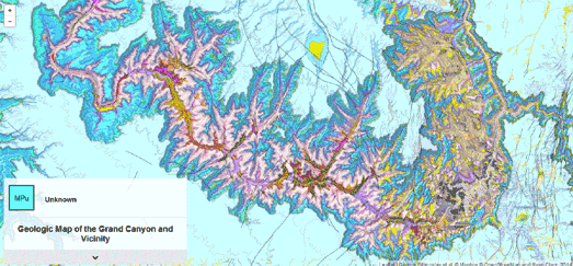
This week my clear favorite map was this wonderful looking map of the Grand Canyon. The Geologic Map of the Grand Canyon and Vicinity is a beautiful Leaflet.js based interactive map of the Grand Canyon. The map is based on data gathered by the U.S. Geological Survey.
The map uses different colors to show the different rock units and geologic strata in the Grand Canyon and surrounding area. The map also includes contour lines. If you hover over the map the geologic strata at the selected location is revealed in the small information window. If you click on the map you can learn more about the geologic strata (the information is displayed below the map).

Dublinia is a fantastic looking map and a great way to explore Viking & Medieval Dublin. The site shows how the city grew from a small Viking settlement into a large walled Medieval town.
Dublinia presents an oblique view of the capital, showing how the city developed from 800 AD to 1500 AD. A timeline control allows you to view a series of oblique views of the city for every decade from 800-1500 AD. Select a date from the timeline and the map updates to show you a view of the city for the chosen year.
The map includes a number of map markers which allow you to learn more about a number of Dublin's historical landmarks. If you click on a marker you can watch a video explaining the importance and development of the landmark. Each of the videos includes wonderful animated 3d models and an audio commentary about the chosen landmark's history.

PATTRN is a new open sourced conflict mapping platform developed by Goldsmiths University. The PATTRN platform allows anyone to create an interactive map which can be used to share and collate first-hand reports in conflict or crisis situations.
The platform was first used by Amnesty International in last year's Gaza Platform, to plot 2,700 attacks on Gaza by Israel during the 2014 Gaza conflict. You can also view the PATTRN platform in action in Fortress Europe, a mapped visualization of the Migrant Files data set, and Political Violence in Africa, a visualization of the ACLED data set.
The platform itself can be downloaded from its GitHub repository. Once set-up PATTRN acts as a data aggregator and mapped visualization platform. Users of your PATTRN project can then contribute data about events with space and time coordinates, and to add tags, media and content to those events.
No comments:
Post a Comment