Thursday, August 31, 2017

Mapping Child Care Deserts


It appears that over half of Americans live in child care deserts, areas where it is difficult to find licensed child care. The Center for American Progress has analyzed the locations of licensed child care providers in 22 states (all those that have publicly available databases of licensed child care providers) and determined that much of the USA has inadequate child care provision.

You can explore the results of the Center for American Progress's analysis on their Child Care Deserts Map. The map visualizes the child care provision in 22 states down to census tract level. The initial map view shows the percentage of people living in child care deserts in each state. If you select a state on the map you view the percentage of the population in child care deserts in each census tract in the state.

The Center for American Progress defines a child care desert as "any census tract with more than 50 children under age 5 that contains either no child care providers or so few options that there are more than three times as many children as licensed child care slots".

You can read more about the Center's findings in their article Mapping America’s Child Care Deserts.

4472 San Francisco Families Evicted


The No-Fault Evictions Map visualizes properties in San Francisco where landlords have evicted their tenants using the controversial Ellis Act. It shows both individual properties and an overall choropleth view which shows which San Francisco neighborhoods have seen the most eviction.

The map includes a date control which allows you to filter the map by a specific date range. You can also filter the map by type of eviction. If you click on a neighborhood you can view the total number of evictions in the area during the selected time period. If you click on an individual property marker on the map you can view that property's address.


The Anti-Eviction Mapping Project has also been mapping Ellis Act Evictions in San Francisco for a number of years. Their Ellis Act Evictions Map features an animated timeline map of Ellis Act evictions in San Francisco from 1997 to the present day.

The map shows the location of properties where 4,472 San Francisco families have been evicted. The size of the markers shows the number of evictions made at that property. The Ellis Act gives landlords the right to evict tenants in order to "go out of business". Judging by this interactive map some San Francisco landlords seem to have gone out of business quite a few times now.

Wake to the Sounds of Nature


Wake each morning to the sounds of nature with the EcoAlarm. The EcoAlarm will gently wake you every morning using specially recorded sounds from some of the world's most natural environments. As you wake to the sounds of water flowing and birds singing you will also be helping to save the forests of Argentina.

EcoAlarm is an alarm clock application that wakes you using the sounds of the world's forests. It uses one of nine natural soundscapes which is played via Spotify. This means that as you wake you are also helping to generate royalties to save Argentinian forests.

To show how EcoAlarm is helping endangered ecosystems the app's developers, the Banco de Bosques Foundation, has also created a global dashboard. This dashboard shows the number of alarm calls made by EcoAlarm and the amount of forest that has been protected by the Banco de Bosques Foundation. The dashboard also includes an interactive 3d globe created with HTML5 and ThreeJS. You can click on the green markers on the globe to view the current time in that city. When you select a city on the globe you can also listen to one of the nine natural soundscapes recorded for EcoAlarm.

The EcoAlarm app is available from Google Play and iTunes.

Wednesday, August 30, 2017

The Emoji Map Generator


You have probably dreamed all of your life that one day you will have your very own Emoji Map. Well today that life-long dream becomes a reality - thanks to the Emoji Map Generator.

The Emoji Map Generator can create an emoji map for any location in the world. Just select the area you want to map and click 'generate'. It really is that simple. You now have an Emoji Map.

But "Hold on"", I hear you ask. "I don't want a tree emoji on my map. I want a leaf emoji."

Don't panic! The Emoji Map Generator has got you covered. You can change any of the emoji images on your map to a different emoji image of your choice. To do this simply click on one of the four preset emojis and cut & paste your own emoji in instead. If you need a little help you can select and copy the emojis from EmojiCopy.

Of course you might want your car emoji to appear in parks and not on roads and your wave emoji to appear where buildings are. Don't worry, you can do that too. To change where an emoji will appear on the map simply type in the RGB code of the map's base color where you want the emoji to appear.


One problem you might encounter with your new Emoji Map is that all those emojis can make it difficult for other people to recognize the area you have mapped. In that situation you can show your friends the location of your Emoji Map by using What3Emojis.

What3Emojis is a revolutionary new way of addressing the entire world using the only common language of the entire human race, the emoji. With What3Emojis the Earth is divided into 4m x 4m squares which are randomly assigned a unique three-emoji combination. If you want to share your location with someone else all you need to do is share the three emojis assigned to that location.

2017 Tour de Turtles


Soca, the Leatherback turtle, is currently leading this year's exciting Tour de Turtles. With 63 days left in this annual endurance race Soca is currently around 200 miles in front of Lincoln in second place. However, with 6 days still remaining in the Tour de Turtles, this race is still wide open.

Every year Sea Turtle Conservancy track the marathon migration of sea turtles from their nesting beaches in Panama to their foraging grounds in the Gulf of Mexico. Each year's race begins on the 1st August 1st and lasts for approximately three months. The race element of the Tour de Turtles is simply based on the tracked turtle who swims the furthest in the three months of the experiment.

You can view how each turtle is doing by viewing its own interactive tracking map. The map shows the track of the selected turtle sine August 1st. It also shows you how many miles the turtle has swum and how many days are left in this year's Tour de Turtles.

Tuesday, August 29, 2017

Hazards in Houston


The Houston Ship Canal is home to the USA's largest petrochemical complex. Along the canal there are 10 major refineries and dozens of chemical manufacturing plants. The Gulf Restoration Network has mapped these and other oil facilities in the Gulf Coast that are in danger from flooding.

ExxonMobil admitted today that two of its refineries have been damaged by Hurricane Harvey and have released hazardous pollutants. One of these refineries, the Baytown oil refinery, is the second largest in the USA. The Beaumont refinery is the other ExxonMobil facility to report releasing hazardous pollutants. The Washington Post reports that "most of the other facilities belonging to major companies also filed notices with the Texas Commission on Environmental Quality".

The Oil Contamination Risk map uses United States Environmental Protection Agency data to show oil facilities located at low elevations. If you zoom in on Houston you can view the locations of the facilities which are in danger from the present flooding. You can click on any facility on the map to discover its name.

ProPublica & the Texas Tribune has explored some of the inadequate defenses in place to protect these facilities. In Hell and High Water they explain the history behind the current defenses, some of the recent studies on improving their protection, and the reasons why Texan politicians will probably never support the building of proper flood prevention measures in the state.

Civil War vs Civil Rights


Caroline Klibanoff of Northeastern University has created an interactive map which shows where the southern states have memorialized the Civil War and the Civil Rights Movement in street names. She has analyzed 6.8 million street names to find those streets named for Confederate and Civil Rights Movement leaders.

In Public Memory and Street Names in the South Caroline shows these Confederate and Civil Rights Movement named streets on one interactive map. The result is an incredibly well balanced map, with 1,132 streets named for Confederate leaders and 1,118 named for Civil Rights leaders.

Caroline's investigation into street names includes an interactive map which shows streets named 'Dixie' throughout the United States. This map reveals that the South has 1,000 Dixie named streets, while the North has just 72.

The Southern Poverty Law Center has found over 1,500 symbols of the Confederacy in public spaces, mostly in the southern United States. These include not just roads named for Confederate leaders and battles but statues, memorials and schools as well. In Whose Heritage? Public Symbols of the Confederacy the SPLC has included an interactive map showing the location of these Confederate symbols and memorials. The map uses color coded markers to show which are monuments, which are schools and which are roads.

Exploring Trump's Wall


Reveal from the Center for Investigative Reporting has been collecting data on the US-Mexico border for a number of years. They have spent a long time mapping the existing border fence using satellite imagery and government PDF maps of the border.

From this data Reveal has discovered that around 700 miles of the 1,954 mile long U.S.-Mexico border is already fenced. Trump's new wall will therefore need to be at least 1,300 miles long. That's a lot of Chinese steel. You can explore Reveal's work on their The Wall interactive map. The map shows the current fence and shows where it is a 'vehicular' and where it is a 'pedestrian' fence. The map also shows where no fence currently exists.

You can get a good sense of the scale of construction needed to build Trump's new wall in a video from the Intercept. The Intercept downloaded and stitched together 200,000 satellite images to create a huge strip map of the U.S.-Mexican border. You can view this strip map in Visualizing the U.S.-Mexico Border, a short video which pans along the whole border.

Another interactive map of Trump's proposed wall also exists. Doug McCune has used Mapbox GL to create a 3d map of Trump's wall. The wall on this map is colored in a patriotic red, white and blue. However the scale of the wall is probably a little out (it appears to be at least 10 miles high on Doug's map).


From Donald Trump's 'detailed' construction plans we know that the Trump Wall will be up to 15 meters high, made of concrete and steel (but also possibly fencing) and will be 1,954 miles long. If you are having difficulty envisioning just how far 1,954 miles is then you can use the Berliner Morgenpost's interactive map. The Trump Wall Comparison Map allows you to overlay an outline of Trump's proposed border wall between the USA and Mexico on any location on Earth.

If you want to create your own Trump Wall map then you can get Reveal's data for the US-Mexico border fence on Github. You can read more about how this data was collected and mapped in the Reveal article The Wall: Building a continuous US-Mexico barrier would be a tall order.

Monday, August 28, 2017

Houston, We Have 3 Problems!


Houston buildings flooded in the 2015 Memorial Day Floods and in the 2016 Tax Day Floods

The city of Houston has three major problems: global warming, geography and deregulation. All three problems were brilliantly illustrated by ProPublica & the Texas Tribune last year in their series on Houston's Flood Risk.

One article in this series, Boomtown, Flood Town, pointed out that (even before this year's disastrous flooding) some parts of Houston had been flooded three times in eight years. Politicians and city leaders in Houston seem very keen to portray this year's flooding as a once in a century event. The scale of this year's storm may well be unprecedented but Houston is becoming all too used to flooding.

In less than three years Houston has suffered from the 2015 Memorial Day Floods, the 2016 Tax Day Floods and now from the flooding caused by Hurricane Harvey. Even the most ardent climate change denier must acknowledge that flooding in Houston is becoming almost an annual event. The authors of Boomtown, Flood Town argue that "climate change is causing torrential rainfall to happen more often, meaning storms that used to be considered 'once-in-a-lifetime' events are happening with greater frequency."

One reason that city leaders might be so keen to blame 'once in a lifetime' events for the city's flood problems is that they have increased the risk and damage caused by flooding by encouraging deregulation. As Boomtown, Flood Town points out the huge growth of Houston has been encouraged by politicians who have been eradicating proper building and environmental regulations, "allowing developers to pave over crucial acres of prairie land that once absorbed huge amounts of rainwater."

Which leads us to one of Houston's other main problems - geography. Houston is built upon a swamp. The Houston Chronicle's article, The Trouble with Living in a Swamp, explains how the city was built by drainage and exists only because of the 2,500 miles of managed waterways that help drain water out into the sea.

However Houston's natural flood defenses are fast being eradicated. The Boomtown, Flood Town authors say that "almost 30 percent of freshwater wetlands were lost between 1992 and 2010". At the same time "impervious surface in Harris County increased by 25 percent from 1996 to 2011". Where once freshwater wetlands served to prevent flooding Houston now has impervious surfaces, which only help to worsen the effects of localized flooding.


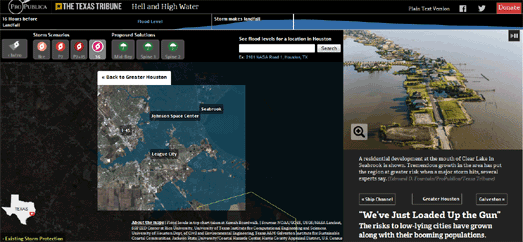
Another article in the Houston's Flood Risk series was Hell and High Water. In this mapped visualization the author's warned of the dangers Houston faced from a future hurricane. The mapped interactive in the article simulates the likely effects of a number of potential storms on the city of Houston. Each of these simulations overlays the track of a potential storm over a satellite view of the city. These tracks are then animated to show the likely flooding events that could take place in Houston if such a storm hit the city.

Of course that storm has now hit the city. It was called Hurricane Harvey.

The article argues that not enough has been done to protect the city from potential future storms. Dr. Bill Merrell, a marine scientist at Texas A&M University, believes that the city needs to build floodgates at the entrance to Galveston Bay. He predicts something will be built - four years after the next devastating hurricane. Well Houston has now had that devastating hurricane so lets see if those floodgates get built.

Luckily for Houston America now has a president who believes in infrastructure. President Trump is visiting the city on Tuesday. He will presumably use the opportunity to announce his government's financial support so that the city of Houston can finally build adequate flood defenses. He will no doubt also use the visit to renounce his support for deregulation and to finally support international efforts to fight climate change.

Saturday, August 26, 2017

Can You Afford the American Dream?


A new map from Esri shows where in the United States real-estate property is most and least affordable. In much of the USA housing supply has not kept pace with housing demand, pushing the cost of property higher. The result is that in many areas large numbers are priced out of the housing market and many Americans are now unable to buy their own home.

The Housing Affordability Story Map uses Esri’s Housing Affordability Index to map the local affordability of housing across the United States. Esri's index shows the ability of a typical resident to purchase an existing home in the area where they live.

The Housing Affordability Story Map shows two main map views of housing affordability. One uses Esri's Housing Affordability Index, while the other looks at the share of income to mortgage. On the maps the red and green shaded areas are the areas with the least affordable housing. The areas shaded the darkest gray are the most affordable.

One problem that Esri's Housing Affordability Map reveals is that much of the population is concentrated in densely populated metropolitan areas where housing affordability is low. These are areas where there is a limited housing supply and expensive real-estate. On average metropolitan areas represent the least affordable housing markets. Unaffordable areas are usually concentrated in large coastal metropolitan areas (where home values are high and where rents are sky rocketing) such as San Francisco, Los Angeles, New York and Boston. These areas are shown in red on the Housing Affordability Map.

Friday, August 25, 2017

Hurricane Harvey Information Map


Hurricane Harvey is expected to strike Texas on Friday. Alongside the predicted high winds the storm is forecast to drop more than 35 inches of rain onto some areas and to cause a storm surge along the coast. There is therefore the danger of widespread flooding. To help you prepare for the coming storm Esri has released its Hurricane and Cyclone Public Information Map.

Esri's map identifies the potential impact of Tropical Storm Harvey through a variety of different map layers. These layers include:

The Public Information Map - the initial map view identifies the current and recent location of Harvey. It also provides forecast positions and the storm's probable track. The shaded area on this map layer is the 'cone of uncertainty', the likely path of the center of Harvey.

The Impact Summary Map - shows the storm surge by identifying locations most at risk for life-threatening inundation from storm surge. The total population at risk is 248k people, 99k households, and 10k businesses.

The Forecast Precipitation Map – this map forecasts the amount of rain expected within the next 72-hour period.

Dragon Tracking Map of Essos


Carto has released a new basemap. This new map allows you to create your very own interactive Game of Thrones maps. Carto's Game of Thrones basemap includes the continents of Westeros & Essos and also shows the locations of the major towns and roads.

You can learn more about the design of the Game of Thrones basemap on the Carto blog post, Our Game of Thrones Basemap is here to unite the Seven Kingdoms. The post includes a demo map of the new Games of Thrones basemap in action as an interactive map.

If you want another demo of the Game of Thrones basemap in action then you can check out my Dragon Tracking Map of Essos. This map allows you to follow the movements in real-time of Daenerys Targaryen's dragon Rhaegal. I knocked this demo up very quickly using code from Ramiro Aznar's How to make your markers move with Leaflet.js demo.

Thursday, August 24, 2017

Protecting America's National Monuments


While Donald Trump is keen to protect monuments to the Confederate states he is just as keen to remove protection from America's National Monuments. He doesn't want to "see the history and culture of our great country being ripped apart" but would like to rip apart some of the country's most beautiful environments.

Under the Antiquities Act of 1906 United States Presidents can designate areas as 'national monuments' due to their natural beauty or cultural significance. Unfortunately where previous presidents have seen natural beauty Donald Trump sees a quick buck. He would therefore like to strip national monuments of their protection.

In April Donald Trump signed an executive order directing his interior secretary to review the designation of these national monuments. In response the Natural Resources Defense Council has created an interactive map so that you can learn more about America’s national monuments and the value that they bring to the country.

America's Monuments: Worth the Fight uses the Esri Story Map format to show you where each of the national monuments are and to tell you about why each is so important. The information provided for each monument includes its size in acres and the year that it was established.

The First Fall Foliage of 2017


Country Living has announced the first sighting of the migratory Fall Foliage Map of 2017. The end of summer in the USA is always heralded by the first arrival of the annual Fall Foliage Map. This year Fall has arrived a little early and Smoky Mountain has already captured the first Fall Foliage Map of the year.

According to Smoky Mountain's map people living in New Hampshire, Vermont, Idaho and Montana can expect to see changes in leaf color as soon as next week. If you want to see when you can expect the full glory of Fall colors in your area then use the date slider control beneath the map to change the date shown on the map.

If you want to know the best time to view the Fall colors in your area then you could try the Weather Channel's Fall Foliage Peak Times map. This map is color coded to show the dates of peak Fall foliage throughout the USA. If you hate falling leaves and can't wait for all the Winter fun to begin then you can cheer yourself up by checking out NOAA's First Snow Map.

The German Election Candidates Map


On 24th September Germany will go to the polls to elect the members of the 19th Bundestag. The Berliner Morgenpost has created a fantastic visualization which helps to explain who the 2,559 candidates are, what they stand for and where they come from.

Each of the 2,559 candidates in the 2017 federal election are represented in the Alle 2559 Direktkandidaten – Wer sie sind, wofür sie stehen visualization by a colored dot. As you progress through the visualization these colored dots are continually rearranged to group the candidates by political party, by professional / occupational background, by gender, age and by place of birth.

The place of birth of all 2,559 candidates is shown by placing each of the colored dots on a Leaflet map. Unfortunately you can't zoom in on the map. Most candidates were born in Germany. However, because you can't zoom in on this big cluster of dots, it is impossible to view the geographical distribution of the candidates' birthplaces within Germany.

5.4 percent of candidates were born outside the borders of the Federal Republic. Unfortunately the inability to zoom in on the map places much more attention on these foreign born candidates. As these foreign born candidates are the only individual dots that you can make out on the map's default zoom layer they are the dots that you are most likely to interact with on the map - with the perhaps unintended consequence of emphasizing their 'foreignness'.

Wednesday, August 23, 2017

Funny & Rude Street Signs


The small village of Sandwich, Kent in the UK is just a couple of miles from the even smaller village of Ham. This street sign, pointing the direction to both towns, is one of the most photographed signs in the country.


In the USA there are also lots of intersections which have inadvertently funny or interesting street signs. For example, there's the Inyo / Butte intersection in Bakersfield, California. There's also a super Clark / Kent intersection in Buffalo, New York.


If you want to find your own funny intersections then you should use Crossing.us. This fantastic website allows you to enter any two words to find out if any intersections in the United States have the entered two names. If there are Crossing.us will show you the location on a Google Map.

You don't need to use Crossing.us to find rude or funny intersections. Why not enter your name and the name of your significant other to see if you have your very own romantic intersection. If you do then you might even be able to find an image of the intersection sign by searching the provided Street View.

In the interests of reconciliation I was hoping to find a Trump / Clinton intersection. There doesn't seem to be one, however there is a Trump / Power intersection. There are also quite a few Clinton / Washington intersections.


Some of my other favorite intersections are:
Crooked / Strait
Easy / Action
This Way /That Way
Somewhere / Where Else
Klingon / Romulan

The possibilities are endless with Crossing.us. If you find any more that you like then let us know in the comments.

Singapore in Glorious 3D


The Straits Times has created a very impressive 3d map of Singapore to illustrate an investigation into who owns the buildings on Singapore's most famous shopping street. Who Owns Orchard Road? explores the diverse ownership of individual buildings on the city's main retail street.

We can't be sure how this impressive 3d map was built because essentially we never get to interact directly with the map. The initial story map progression through the buildings is all managed by video. The developers have videoed a linear pan of the map from one building to the next. The progression through the story map is therefore controlled by simply playing and pausing this video.

Once the videoed story map has completed the video is replaced with what is essentially a picture map (or two picture maps - as the zoom button switches the image of the 3d map to a zoomed in picture of the same map). Buildings on the image map have been made interactive so you can click on the colored buildings to learn more about who owns the property.

The use of a video and picture map is an interesting hack which enables the Straits Times to provide a very detailed 3d view of Singapore. This level of detail presented in an interactive map would result in delays for the user as the map would presumably have to be rendered in the user's browser. Currently you can provide a similar looking interactive 3d map but without the level of detail in the building models. If you want to create your own interactive 3d maps then you could start with this tutorial on making Interactive 3D Maps With OSMBuildings.

Tuesday, August 22, 2017

Saying Goodbye to Planet Earth


Have you said goodbye to the rainforest yet? Based on the current levels of deforestation the Amazonian rainforest will be gone in about 250 years time. By the year 2260 most of the rainforest will probably be lost forever. This horrifying forecast comes from a new mapping tool called Co$ting Nature and is based on the current rate of deforestation in the Amazon.

Infoamazonia used the Co$ting Nature information & environment service to project the effects of the current rates of deforestation in the Amazon on the size of the rainforest. The results of the projections can be viewed on Infoamazonia's interactive Forest Cover Through Time map. The map shows Co$ting Nature's projections for the extent of the forest's cover up until it is almost completely destroyed. Just select the date buttons above the map to view the projected forest cover for a specific year.

Infoamazonia's Forest Cover Through Time map is just the latest visualization of the uncertain future humans face if we don't learn to curtail our current levels of consumption. For example, Climate Central recently released an interactive map which reveals how hot your city will be in the year 2100, if carbon emissions continue as currently predicted.

Climate Central's Shifting Cities allows you to choose from a large number of major cities around the world to view the results of global warming in 2100. Climate Impact Lab's Climate Impact Map also visualizes how global warming will effect temperatures around the world over the rest of this century.

The University of Hawaii has released a similar interactive map which uses expected temperature increases to predict the number of deadly days we can expect from extreme heat around the world for each year up to 2100. Heatwaves: Number of deadly heat days provides a timeline control which allows you to view the number of deadly days for any year from 1950-2100.

Thanks to NOAA's Sea Level Rise Viewer we can also observe how these increases in temperature will effect sea levels. By the end of this century the National Climate Assessment estimates that sea levels may rise by up to 6.6 feet. NOAA's interactive map uses the most accurate elevation data available to model how different extents of sea level rise will impact coastal areas in the USA up to the year 2100.

Photo Mapping the Eclipse


NBC News has created a map which allows you to browse photographs of yesterday's eclipse. The map plots the locations of photographs taken during the eclipse and submitted to Instagram.

Spectacular Photos of the Eclipse Captured by Viewers Across the Country allows you to view photos tagged #eclipse on the photo sharing site. Photos have been added to the map in a band from Warm Springs Indian Reservation in Oregon all the way across the country to the beach in South Carolina.

You can view the photos by clicking on the colored dots on the map. Unfortunately, for some inexplicable reason, NBC News has turned off the map's interactivity. This means it is impossible to zoom in on a cluster of markers and select individual markers on the map. This is unfortunate but, when you do select a photo, you can use the forward and back arrows to browse through the other pictures taken nearby.

Of course you don't necessarily need a map to view beautiful photos of yesterday's eclipse. National Geographic and CNN have both put together more conventional galleries of eclipse photographs.

Monday, August 21, 2017

Spying on the Spycams


Surveillance under Surveillance is a global map showing the location of the world's security cameras.

I find Surveillance under Surveillance particularly useful when I'm planning a bank robbery and want to find an escape route free of any potential recording devices. I've also found it useful when trying to meet with Guardian journalists on secret CIA hit-lists, especially when I need to guide the journalist through a heavily monitored public space like Waterloo train station.

All the camera locations for the map come from OpenStreetMap. Therefore if you want to help keep the map up-to-date and accurate you can contribute missing camera information using an OpenStreetMap account. There are brief instructions for doing this under the 'How' section of Surveillance under Surveillance.

If you want to know how the map was made just scroll to the bottom of the map sidebar. Here you will find acknowledgements and links to Leaflet.js, to the Leaflet plugins used and to other web services used in creating the map.

Mapping Racial Covenants


In the Twentieth Century redlining was used in the United States to restrict financing to black house buyers and property owners. This process was well documented at the time and we can see which neighborhoods were most affected simply by referring to the historical redlining maps, which were created by the Home Owners' Loan Corporation.

However redlining was not the only way that African Americans were discriminated against in the real estate market during the Twentieth Century. Racially restrictive covenants were also used by white home owners in order to ensure that their homes could not be sold to African Americans or other specified racial groups. Most of these covenants included “run with the land” clauses which also legally enforced the covenant on future owners of the property. Thus ensuring that houses could never be bought by African Americans

Mapping Prejudice has created an animated map which shows the spread of covenants over time in Minneapolis. The map shows the growth of the number of buildings in the city placed under racial covenants from 1911 to 1954. As the animation plays you can see how whole neighborhoods are essentially placed under segregation as more and more buildings are given racial covenants.

eclipse-ploitation

If you need a map for today's solar eclipse then you should check out these useful eclipse maps. Some eclipse maps may not be quite as useful. That really depends on how much you like waffles ...


or Dennys ...


Or chicken ...


If you don't want to eat then you could hunt for bigfoot during the eclipse ...


Or flying saucers ...


With apologies to Cartonerd's Becksploitation.

Saturday, August 19, 2017

The Legacy of Redlining on US Cities


The Home Owners' Loan Corporation (HOLC) was a government-sponsored corporation created as part of President Franklin D. Roosevelt's New Deal. Its purpose was to refinance home mortgages which were in default to prevent foreclosure.

The HOLC is often cited as starting the practice of mortgage redlining. Redlining is the process of denying services to residents of certain areas based on the racial composition of those areas. Mapping Inequality, Redlining in New Deal America allows you to view the residential security maps created by the Home Owners' Loan Corporation to indicate the level of security for real-estate investments.

The areas marked in blue on the maps are the neighborhoods which were deemed desirable for lending purposes. The yellow areas show neighborhoods deemed 'declining' areas. The red areas are the neighborhoods considered the most risky for mortgage support.

The result of these redlining maps was that residents in the more affluent and largely white neighborhoods were far more likely to receive financing. Residents in the poorer and black communities were deemed more of a risk and so less likely to receive financial support.


A new map from the National Community Reinvestment Coalition allows you to explore how the HOLC's redlining maps are affecting cities today. The interactive map allows you to compare modern data about income status and the minority population with the HOLC's historical redlining security ratings.

In this way you can see if neighborhoods in your city with 'good' HOLC redlining ratings have remained largely white and wealthy or whether your city has become a beacon of social and racial equality. You can also use the National Community Reinvestment Coalition map to see where gentrification has occurred in a city. These are the neighborhoods which received the lowest HOLC redlining ratings but now don't have the dots from the 'Low to Moderate Income' layer.

Friday, August 18, 2017

Help Partition India


Seventy years ago a British lawyer called Sir Cyril Radcliffe was asked to draw the border that would divide British India into two countries. Now it's your turn.

Radcliffe's new boundaries were formally announced in August 1947. The announcement left around 14 million people in the 'wrong' country. In the violence that followed around 1 million people lost their lives. After witnessing the chaos that followed his partition of India Radcliffe at least had enough shame to refuse his 40,000 rupee salary.

Al Jazeera don't have a 40,000 rupee salary to pay but they would like your help in dividing British India into two countries. In How were the India-Pakistan partition borders drawn? Al Jazeera has provided you with a map which includes information on where the Muslim, Hindu and Sikh populations live. You just need to draw the borders on the map to create two new countries.

After you have drawn your borders you will be shown the original Radcliffe Line.

Avocado Toast or New Home?


Avocado toast or new home? It really is that simple. Millennials need to stop complaining and start saving.

All millennials seem to do is sit around eating avocado toast and whining about how they don't have enough money to buy a house. Well millennials if you want to own your own home then you need to grow-up, stop complaining and start saving. Just forget the avocado toast. Instead take a packed lunch to work everyday and you will be able to afford a home in Hackney in just 60 years time.

Look Mr & Ms Hipster if you want to buy a home in London then you could drink instant and not hipster coffee. If you do stop drinking expensive coffee in hipster cafes and switch to instant coffee then you could save yourself enough money to buy a home near Borough Market in as little as 83 years.

If you need any more hipster saving tips then you should visit finder.com's guide to How millennials can save their way to a London property. The guide consists of an interactive map which basically shows the (un)affordability of property in each London borough. However if you click on a borough on the map you can discover finder.com's (tongue in cheek) handy tips on saving money. Each saving exercise includes a guide as to how many years you will need to save to buy a property in the selected borough.

Thursday, August 17, 2017

Food Insecurity in America


Food Insecurity in the United States is an interactive map which shows the number of people who need food assistance in each county in the United States. The map uses data from Feeding America’s annual Map the Meal Gap project.

There are a number of clusters of counties, especially in the south east, which have high levels of food insecurity. Many of these, for example in the Mississippi Delta are in areas where agriculture and food production are the biggest industries. I wonder if Monsanto knows why that is?

If you select a state on the map you can view a detailed overview of food insecurity in the state. You can also click on individual counties to discover the food insecurity rate and the number of food insecure people in the selected county.

The map uses the USDA’s measure of food insecurity which refers to a lack of access to "enough food for an active, healthy life for all household members". To determine the food insecurity rates Feeding America use a number of economic indicators and responses to the Current Population Survey.

Donald's 'Beautiful Statues'


The Southern Poverty Law Center has found over 1,500 symbols of the Confederacy in public spaces, mostly in the southern United States. These include not just statues and other memorials but schools, parks and roads which have been named for Confederate leaders or battles.

In Whose Heritage? Public Symbols of the Confederacy the SPLC has included an interactive map showing the location of these Confederate symbols and memorials. The map uses color coded markers to show which are monuments, which are schools and which are roads. If you select a marker on the map you can also see the year that this selected memorial to the Confederacy was dedicated.

The SPLC has used these dates of dedication to also provide a timeline of when memorials to the Confederacy have been dedicated since the end of the Civil War. This timeline shows that there have been two main periods which have seen spikes in the number of Confederacy memorials being dedicated. The first was in the first two decades of the Twentieth Century. The second was in the 1950's and 1960's.

The SPLC has its theories about why these periods saw spikes in the number of Confederacy memorials being dedicated - but you'll have to read the SPLC article to discover what those theories are. 

Wednesday, August 16, 2017

Dancing Maps


I've just spent the last ten minutes singing to a map. The map enjoyed it and even danced for my pleasure.

You too can make this map dance. Just turn on your microphone when prompted and then start singing your favorite song. If the map likes your voice then all the buildings will start dancing for you.

The dancing map is possible because of Mapbox GL's runtime styling capabilities. The map uses the audio input (using the Web Audio API) to dynamically change the building heights on the map and the intensity of the light. You can read more about the technical details on the Mapbox blog.


If you get bored singing to a map then you could always listen to a map or play a tune on one instead. MTA.me Conductor has turned Massimo Vignelli's 1972 New York subway map into a string instrument. The map simulates trains moving on the MTA subway network and plays a note every time a subway train crosses the track of another train.

If the New York subway map can be a stringed instrument then maybe the map of Ohio can be a piano. Ohio has 88 counties, a piano has 88 keys, so obviously Ohio is a Piano! Just click on a county to play a note.


If the New York subway can be a stringed instrument and Ohio can be a piano then Aberdeen can be an orchestra! Marker / Music lets you mix your own music by clicking on different locations and playing the music that was recorded at each location. You can combine any of the recordings to create your own unique mix directly from the map.

The Best Views in London


What do you get if you ask a computer to find the most scenic places in London?

The answer is this map of London's Most Scenic Views.

Researchers at the University of Warwick trained a neural network on images from ScenicOrNot. ScenicOrNot is an online data science project which asks people to rate the views depicted in photos by how scenic they are. The neural network was used to identify the common features found in the  photos which have been voted as the most scenic.

Once the neural network worked out the features that make a photo scenic or not it was set loose to find the most scenic photos in Geograph's collection of images of London. The Geograph British Isles project is collecting geographically representative photographs and information for every square kilometre of Great Britain and Ireland. It currently has over 240,000 photos of London, covering ever square kilometre of the city.

The University of Warwick's artificially intelligent neural network was therefore able to scan photos from all over London to find the most scenic photos in Geograph's London collection. You can explore the most scenic views found in this interactive map of London's Most Scenic Views.

Tuesday, August 15, 2017

The Dot Map of Canadian Languages


The Dot Map of Canadian Languages uses data from the 2016 census to show the mother tongues of everyone in Canada. The map provides a great overview of where different language speakers live in each Canadian town and city.

Unfortunately the map doesn't come with any information so I can't be entirely sure how many people each dot represents. Each dot could be one language speaker or each dot could represent 10 or even 100 people. Census dot maps don't usually reveal the exact location of each person in the census. Usually the data is randomized within each census ward. This is still accurate enough to give a good overview of where clusters of different language speakers can be found in a town or city.


The Dot Map of Canadian Languages is the first interactive map I've seen using the recently released data from the 2016 census. However there are a lot of interactive language maps which have been produced using the language data from the 2011 census.

For example, you might be surprised to learn that in the far north of Canada, in the Northwest Territories, the most spoken language (after French and English) is Arabic. The 10 and 3 mapped the most prevalent languages, besides French and English, spoken in Canadian homes using data from the 2011 census.

Canada’s Far-Flung Language Enclaves shows the results of the analysis on a Google Map. Each census division on the map is colored by the most prevalent language. You can mouse-over each division on the map to view the percentage of the population which speaks the most prevalent language (after French & English).


Using data from the 2011 Canadian census CBC has mapped Quebec's English speakers. The Where are Quebec's Anglos? map shows the number of people in Quebec's census districts who self-indentify as Anglophone. Users can select from regions in the map sidebar to zoom the map to specific locations. The map displays a heat map of census results showing where English was given as the mother tongue or the language most used at home.

The highest density of English speakers (although small in total population) seems to be among the hardy folk living on the Côte-Nord.


Global News has also used the language data from the 2011 Canadian census to create mapped visualizations of the leading mother tongues by census tract in a number of cities.

The Google Map for each city allows users to view the percentage of different language speakers in each census tract. The maps also include other census topics, such as age, gender and the number of children.

Solar Eclipse Simulators


Next Monday everyone in the United States, even in Alaska and Hawaii, will be able to witness at least a partial solar eclipse. If you want to know how full an eclipse you will see then you need the HeyWhatsThat 2017 Eclipse map.

The HeyWhatsThat solar eclipse preview tool is very simple to use. You simply need to click on the Google Map to show your location and you can instantly see what the eclipse will look like on the accompanying map of the heavens.

If you enter your zipcode into Vox's Solar Eclipse Simulator you can also view a simulation of what the moon passing in front of the sun will look like from your location. The simulation includes information on what time the eclipse will peak and what percentage of the sun will be obscured.

If you want to see a total solar eclipse then Vox has also got you covered. The Solar Eclipse Simulator includes a Mapbox map which reveals the closest point to your location where you can view a total solar eclipse. It even tells you how far you have to travel to get there.

Bat Detectives


There were 5117 bat calls made in my local park last night. Actually there were probably a lot more, but 5117 of them were captured by the bat sensors in the Queen Elizabeth Olympic Park in East London.

The majority of the bat calls detected were recorded by Sensor 7. There are 15 sensors in total, although Sensor 15 and Sensor 4 don't seem to be working at the moment. Sensor 1 and Sensor 3 do appear to be working but didn't detect any bats last night. You can view the results from each sensor for yourself on the Bats Live interactive map.

Bars Live is a project by Nature-Smart Cities. To monitor bat activity in the park Nature-Smart Cities has developed a smart bat monitor which works like a 'Shazam for Bats'. Each of these sensors captures the surrounding soundscape and detects bat calls within the captured sounds.

The sensors are located in different habitats within the park (if you click on a sensor's map marker you can learn about the immediate surrounding habitat of that sensor). The bat sensors will continue to monitor bat activity in the Olympic Park until the end of the year.

Monday, August 14, 2017

Every Wind Farm in America


The American wind energy industry is expanding very quickly. Over $143 billion has been invested in new wind energy projects in the United States in the last 10 years. You can view how the number of wind farms has grown in the USA since the 1980's on a new interactive map from the American Wind Energy Association.

The AWEA's new U.S. Wind Industry Map shows the location of every utility scale wind project in the country. The map also shows the location of all wind-related manufacturing facilities.

Each wind farm is shown on the map with a blue map marker. The size of the marker represents the wind farm's capacity. A timeline feature allows you to watch an animation of how the number of wind farms has grown since 1981. If you press play on the timeline you can watch as each wind farm is added to the map by the date of its construction.

If you zoom into coastal areas on the map you can see how little offshore wind energy production there currently is in the United States. The first offshore wind farm in the US only started operation in 2016 at Block Island Wind Farm off the coast of Rhode Island. There are other projects under development in wind-rich areas of the East Coast, Great Lakes and Pacific coast.


The United Kingdom currently generates a higher percentage of its electricity from offshore wind farms than any other country. You can view the output of the UK's offshore wind farms on this Offshore Wind Electricity Map.

The map shows the locations of the UK's offshore wind farms. Each wind farm is represented on the map by a scaled animated wind turbine marker. The size of the marker represents the scale of the current output from each wind farm. If you select a marker on the map you can view the name of the wind farm and its current output in megawatts.

The map sidebar shows a dashboard reading of the share of the UK's electricity currently being generated by offshore wind. If you select a marker on the map the dashboard updates to show the operator of the selected wind farm, the site capacity, the number of turbines and the type of turbines.